Lettering and script tattoos: fonts, size and words that last
A lettering tattoo puts words on skin: a name, a date, a line from a song or poem, a word that matters. It sounds simple, but lettering is one of the most demanding styles in tattooing. Letters have to be readable, evenly spaced and spelled correctly, and they have to stay readable as the skin ages. This guide explains the main lettering styles, how size and placement affect readability, and how to find an artist who specialises in it.
Lettering is a specialism
Good tattoo lettering is drawn, not typed. Many lettering artists design each piece by hand, adjusting letter shapes, spacing and flow so the words fit the body and read as one unit. A font from a computer can be a starting point, but it is rarely the end result. That's why a lettering specialist often delivers a better result than simply printing a font and tracing it.
Common lettering styles
- Script: flowing, connected letters inspired by handwriting and calligraphy, often with flourishes
- Blackletter: also called Old English or gothic, with dense, angular letters and strong contrast
- Chicano lettering: a distinctive style of script and blackletter developed in Chicano tattoo culture, often in black and grey
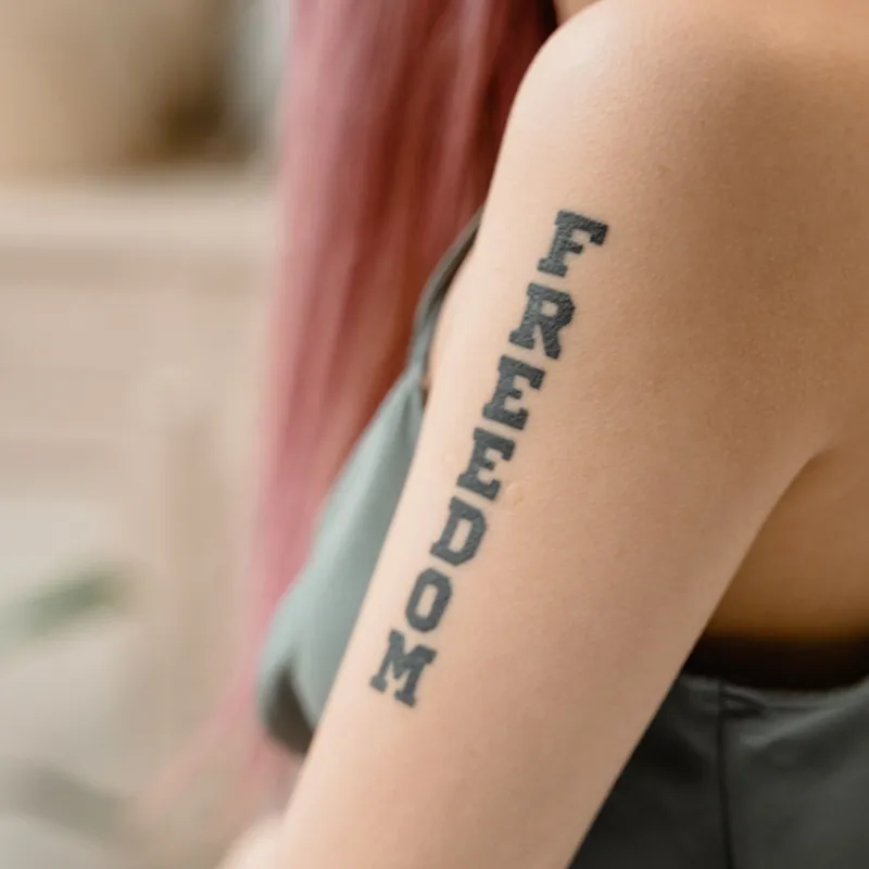
- Block and serif letters: clean capitals, as in sports or signage lettering
- Typewriter and small sans-serif: minimal, understated text
- Handwriting: a loved one's own handwriting, traced from a card or letter
Each has its own strengths. Script feels personal and elegant, blackletter is bold and traditional, small typewriter text is subtle but needs care to stay readable.
Size, spacing and readability
The biggest risk with lettering is making it too small. Over the years, ink spreads slightly under the skin. Lines that sit very close together, such as the inside of a small "e" or "a", can fill in and blur. To keep text readable:
- Give letters enough height, especially in script, where loops and thin strokes are close together
- Keep spacing generous between letters and lines
- Choose fewer words for small areas, or more space for longer quotes
- Avoid very thin hairlines on small text
Fine, delicate text is popular, and it can work well when it's done with enough size and spacing. Our fine line tattoo guide explains why fine lines need room to age well.
Placement
Lettering follows the shape of the body. Common placements:
- Forearm: easy to read for yourself and others
- Collarbone and chest: good for a line of text that follows the curve
- Ribs and side: long quotes, though this can be a sensitive area
- Back of the neck and spine: vertical or short text
- Fingers and hands: popular, but small letters on hands tend to blur and fade faster
Think about who the text is for. If you want to read it yourself, it may need to be placed or oriented differently than if it's meant for others to see.
Spelling, language and dates
Check every letter before the session. Typos in tattoos are more common than people expect, especially in names, dates and other languages.
- Write the exact text down and send it in your request, rather than saying it out loud
- Double-check accents, capital letters and punctuation
- For other languages, ask a native speaker to check both grammar and meaning
- Confirm date formats, because 03/04 means different things in different countries
Your artist will usually show you the stencil before tattooing. Read it slowly, letter by letter.
Names and memorial text
Many lettering tattoos honour someone: a child's name, a parent's handwriting, a date of birth or a last message. These pieces matter, so take your time. Collect the material carefully, such as a clear photo or scan of handwriting on a plain background. Decide whether you want the text exactly as written or slightly cleaned up for readability; an artist can straighten a shaky line without losing the character of the hand. For names, think about whether you might add more later, such as siblings or grandchildren, so the first piece leaves room.
How lettering ages
Bold lettering, such as blackletter and block letters, ages well. Script holds up when it has enough size; very small script can blur. Areas with a lot of friction or sun, such as hands and fingers, fade faster. Good aftercare matters in the first weeks; our tattoo aftercare guide explains what usually happens while a tattoo heals.
Combining lettering with imagery
Words are often combined with an image, such as a name with flowers, a date in a banner or a quote around a portrait. Plan both together, so the text fits the image rather than being squeezed in afterwards. Banners and ribbons are a classic way to frame text in traditional and neo-traditional styles.
Choosing a lettering artist
- Look for an artist whose portfolio includes plenty of lettering, ideally in the style you want
- Check spacing and consistency: letters of the same kind should look the same
- Look for healed photos of small text, to see how it holds up
- Ask whether they draw custom lettering or work from fonts
Our tattoo shop directory lists studios by country and city, with the styles they work in.
Booking
In your request, include the exact text, the style you like, placement and approximate size. Mention whether you want a specific handwriting or font. A clear booking request with deposit means your artist can prepare the design before the session.
For lettering artists
Clients judge lettering on clean, even letters. Photograph text straight on, so it doesn't look distorted, and show healed examples. With the OnlineTattoo.art tattoo website builder your lettering work gets its own place in a portfolio sorted by style.
Photo: Tima Miroshnichenko / Pexels